keskiviikko 27. toukokuuta 2015

Lovebirds

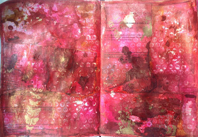
I got a card from my 8 year old son for Mothers day two weeks ago, and really fell for the bird image he had cut out from paper. I probably should use it to make a card for his teacher... I already used it for an art journal page (here) and now I'm using it for my last take on the May calendar challenge at the Craft Barn (prompts Magenta and Flowers). Besides the Craft Barn, I am also posting for the Our Creative Corner challenge (April showers bring May flowers). You can see the card my son made here.


Cutting images from colourful papers paper is just so fun, and I love the magic of finishing the page with sewing and doodling. Even though I'm no excellent doodler (practically limited to dots and small scallops) it always amazes me how cool the effect is. The background has first been stamped with a pile of stamps and then painted with Fresco Finish Bougainvilla paint.

underpapers and gelliprints cut to shape and glued in place...

sewed around and about with my sewing machine

doodles with Sharpie pens
I really like how this turned out... the earlier pages of this collage-calendar can be found here:


Woyww 312

An empty desk for me today, since I'm of to Italy for a field trip with 5 of my students... so I've packed ALL my crafty mess away.


I can see the table could use a wipe now that it is empty (wonder if all that will come of?). The envelope is packed and ready for the ATC swap, I guess I'll send it from Italy. My passport was in the wrong place and should be packed away shortly, and my purse looks empty and thin compared to usual, because I cleaned out all the paperwaste and bonuscards it usually is stuffed with. I've prepared one crafty post that I'm going to publish after this one so my blog doesn't show a desk for a whole week :) More interesting desks to be found at Julia's, join in the fun!

sunnuntai 24. toukokuuta 2015

Words for thought

I have been following the Paperartsy Words-challenge posts during these past two weeks. I really liked the idea of an altered book with quotes... I've been planning to do one for ages, but haven't got around to it, so now was about time. Besides, I'm going to travel for a week, and need to have something lightweight and crafty to do... So I chose a small book from my pile of alterables. While it was on the table waiting for something to actually happen, the Stampotique Designers challenge changed to "Something old, something new..." and of course this fits that excellently! I'm making something new out of something old, all the quotes that I'll add inside will be borrowed from someone else and the book happens to be blue... and then the Craft Barn weekly challenge posted for holidays, and my "travel light" project suits that too, so here it is:


I liked the canvas cover and the small gold embossed image with a glove and carnations, so I decided to do as little to it as possible. I took out a homemade paint spray I made a few weeks ago and before spraying covered the golden image with Glossy Accents and adhered my new book title (Grungeboard letters). While spraying I had a piece of kitchen towel and a baby wipe at hand, using them to wipe over the glossy accents before the spray dried. The GA gives quite an effective resist effect. I spread golden embossing powder on the spine of the book... I'm wishing I had some more course powder, but this will have to do. I love the combination of blue and gold, so I continued with Inka Gold wax over the letters and edges of the book.


The story in this book is quite pathetic, nothing to save. I have looked through a free doodle-lettering tutorial at daisyyellowart, and even though I didn't do any of the exercises, it got me encouraged to start writing over the page. At first the text bugged me, and I'll admit that I used a pencil to trace the quote for the first page... I was happy to find that the ink from my Sakura Micron pens didn't seep through the paper which is quite thick and good quality. During the second page I realized the text of the book can be seen as nice lines that make it easier to space the quote and adjust the height of the letters. I want to add some stamping when possible (=at home), and since I want to travel light, I'm going to use this to practise tangles. All I'll need is my Micron pens. Perhaps I'll take some colour pencils too :) here are the few I got started with, nothing finished yet!

No doodling or shades on this one yet... stamps from VivaLasVegaStamps
Shading did quite a miracle, this looks good... Perhaps I'll
add a background colour, just to hide the story of the book.
Stamp from Paperartsy.
I like the effect of the colour, probably need to add shading too, to make the text pop.
Stamp from Stampotique... added some white sharpie to get rid of the text in his face.


keskiviikko 20. toukokuuta 2015

Woyww- it's Wednesday again!

It's Wednesday, and that means it's time to surf the globe and snoop around workdesks... find the blogs here, at the Stamping ground blog. My desk today is about as empty as can be:


I've been working intensively on my art journal, to a state where no desk was enough and everything seemed to be lost under the layers, so I had a tidy up session yesterday. All that's left is a mother's day card I received from my son, a piece of cardstock I ran into while searching for something else, a small book wondering if it should be altered and my everlasting pile of wannabe underpapers. I cut a pattern according to that lovely card (those white pieces a bit further back) and already used those birds in my art journal. I plan to use them still on a calendar page and perhaps on a card too (that yellow one?). Problem is, I have REAL work to do, the school year is ending, and I'm running after stuff that needs to get done, so besides that missing May calendar page I'm trying to cut down the crafting till summer holiday... two weeks, just two weeks :)

tiistai 19. toukokuuta 2015

Rise up to the occasion

I had decided to skip this weeks Stampotique designers challenge (combining animal head to human body), thought I'd concentrate on the VivaLasVegaStamps challenge in stead... but I happened to have some stamps out from a previous project, and realized I could build a lady with a butterfly head, why not? I am also posting for the Paperartsy challenge (words) and the SimonSaysStamp Monday challenge (XYZ...).


I started my project by playing with shrink plastic. I only have transluscent shrink plastic, but I wiped first with white ink, then stamped the striped legs, placed a paper to mask them of and stamped the mannequin body. I used a black pen to fill in gaps and thickened the knob at the top to the same width as the neck. 

It's always surprising how small the shrink plastic becomes...
just perfect for those wings!
I ended up adding two beads to emphasize the butterfly head.
All the used stamps are from VLVS... well, except for the peg stamps that I used for the text. Besides the challenges, I keep an eye on the DLP art journal prompts, and the prompt for this week is modelling paste, with the title "rise up to the occasion". It fit so well with the small sentiment stamp that I wanted to use, that I decided to add it too. I really liked the letter tiles on this post on the PA blog, mine are much simpler: stamped on vellum the letters stand out a bit more, which felt important because there is so much going on in the background. I took pictures of my spread along the way, here they are:
My spread had some inks on from before. I liked the right side,
but decided to cover the whole page. I started  with a layer of gesso
ensure that eventual spraying wouldn't seep through the page. 
The gesso coloured the page yellow. I collaged some sheets of
underpapers in red colours with golden embossing... lots of numbers
here, these are math test sheets! 
Sprayed with  all the reds I have: Dylusions Bubblegum pink,
Cosmic Shimmer Red firefly, added some red bister and water.
Using bleach I stamped all over the page with the writing circles
background stamp. 
Added black stamping with all the dotty, x:y and circly stamps I found...
Also the butterfly has been stamped on the left, but is barely visible.

Bleached out the butterfly... Not all of it reacted with the bleach, so
I also used white pencil and some white Sharpie to make it lighter.
Finished the background with a chevron stencil and black embossing paste.
I had planned to have a vellum butterfly, but it looked so grey I settled for the
grungy bleached out version.
The SSS Monday challenge (XYZ...) is incoorporated in the x- stamps, but also in the end of the school year, when graduating students actually do spread their wings and leave. As a high school teacher, it is always fascinating to watch them grow and leave. In the middle of all the hurry and hustle of test marking and graduation results and preparations, we got word that a student of ours has passed away after fighting an aggresive cancer for a year. I feel the image suits the sad news too, somehow it is impossible to grasp that in reality medics just can't fix everything, someone might have to leave without getting to finish the growing part at all.


maanantai 18. toukokuuta 2015

Ei sentään rikkaruohoja!

Viikon Paskiksessa inspiroidutaan kuvasta. Daalioita minulla ei ole, mutta päädyin vaaleanpunaiseen, naiselliseen värimaailmaan ja kukkasiin. Siis ei daaloihin, vaan johonkin luonnonkukkiin, mitähän lie? Tausta on oikeasti vaaleanpunaisempi kuin näissä kuvissa näyttää. Siihen on (erittäin varovasti ja hellällä kädellä) käytetty punaista ja keltaista bister -jauhetta.


Tausta oli jo ennestään tehty, joten kortti olikin nopea laittaa kasaan. Valikoin leimalaatikosta torson, kukat ja tekstin (vastikään tilattu VivaLasVegaStampsilta) ja kun ne oli leimattu, kaipasin jotain lisää, joten lisäsin taustaleimat ja siivet (nekin VLVS).  Mustat leimaukset ovat Stazon ja harmaat Archival -mustetta. Torso, teksti ja siivet on leimattu erilliselle kartonginpalalle, joka oli värjätty taustan kanssa samaan aikaan. Leikkasin reunoja myötäillen ja pyyhkäisin ulkosyrjät kloriitilla, jotta erottuisivat paremmin. Siinähän se, ihan kiva tuli!


May bunting

I'll admit, that I chose bunting for this page, because I planned to post for the last weeks Craft Barn weekly challenge... I could probably have finished this by the deadline at midnight, but I don't want to loose my any sleep for crafting ( this isn't that serious, right?) so I'm settling for the Craft Barn calendar challenge (prompt words Magenta and Flowers) and the Rubberdance May challenge ( yellow, magenta, purple).


I am making a mixed media style calendar with old book paper as my personal choice for a theme that will tie the pages together. The background is purple watercolour and crackle paste through a TCW stencil. I cut my bunting from the old book paper (sermons from about 1840), stamped with a harlequin stamp from Rubberdance and sewed them in a line. 


I recently bought my first diecut machine, and took it out for the first time! I don't have many dies yet, but I bought this Lily of the Valley die because they happen to be my mom's favourite flowers and cutting was as easy as it should be. Just need to get over the fact that the plates get marks from the cutting... I drew the calendar grid by hand. It runs from Monday to Sunday, as calendars here do, and I also added the Finnish names that are set for each day, because it's always fun to remember a person on their nameday!


The previous pages for this calendar can be found here:
January
February
March

April

sunnuntai 17. toukokuuta 2015

The song of the nightingale

I have been doodle-sewing all week, and wanted to add sewing to my art journal too, after all the DLP prompt for last week was sewing. I am posting this spread for the Paperartsy challenge (words), being intrigued by the way the work on the page effects the words I choose to use, and by the way the words start to effect the page once they've been chosen. I also tend to surprise myself with the way the spreads always continue from the previous finished ones. I couldn't imagine jumping around in my journal doing spreads here and there... I get fixed on colours, techniques, textures and words in a way that makes this some sort of story even though every spread is started as a piece of its own.


I took pictures along the way, this was one of the projects that I stared at more than worked on, getting somehow stuck again and again... part of the getting stuck was also trying out my gelliplate for the first time! I can see myself using it again, it wasn't difficult, but it wasn't as easy as it looks when some professional person makes a perfect page in a video :)


The luscious greens from the gelliplate prints got me thinking about an evening when I was out with the dog, and we both ended up staring at a bush where a nightingale was singing, so I wrote the text ( "hear the song of the nightingale"). After this I realized I should make the text sheet a pouch for my May TH tag, which is different in style but has a music and birds theme... so I had to get some pinks and more music onto my page!
I had used this page as underpaper last autumn, so it was already inky...
I liked the right side and decided to try and cover the red on the left with something.
I used my gelliplate as a stamp straight on the journal page. The journal
spread is 18x12 and my gelliplate 6x6 so that makes 6 prints, each with a
mixture of paints brayered straight on the plate.
I wanted a dusky evening feeling, so I added blue shades (mostly FF Jade)
with a brayer (and found out that it is much easier to brayer on the gelliplate
and stamp on the paper than to brayer straight on paper!). I also used some
background stamps, music among others.
Sewing straight on the journal page is practically impossible, but the leaves
torn from gelliprints were ok to work with. I didn't dare to just sew my text:
I first wrote it with a black pen, and then sewed over it :
Originally I thought not to have any visible birds here, because I've never seen a nightingale, just listened to them singing their heads of in the bushes nearby... but no matter what I did with the leaves, I always felt the right side needed something. I decided to copy the design of the mothers day card I got from my 8-year old son last Sunday, I guess these birds are listening to the nightingale too!


perjantai 15. toukokuuta 2015

Bleached out

My third post for the Chocolate Baroque colour challenge involves lots of shrink plastic and inky backgrounds. Besides CB (orange, purple, pink, maroon), I'm posting for the May challenge at Our Creative Corner (April showers bring May flowers) and the Paperilla card challenge (Flowers, flowers!)


I had an idea of a card with an inky background and shrink plastic flowers growing like hollyhocks... so I made a large amount of flowers in different sizes using the Steampunk flower stamps from CB. With great hopes I made a background using bister, which is a brusho-like product in earth-tones. The red bister turned brown when it dried, parts of the Archival ink stamping dissolved in the bleach when I tried to make the image lighter... I tried spraying with pink, but the image practically returned to what it was before the bleach. I gave up on it, and since there was nothing to lose, I decided to bleach the whole thing just to see what I'd get -the only option being to glue something on top. This is what it became, and I liked it.


Had to try again, here's the next one:


I still had shrink plastic flowers to go, so I made a third background in ATC size, this time I even took photos along the way:
Red bister on Stampinback cardstock. Doesn't seep in, has to be dried with heatgun.
Practically dries into an ugly brown (on porous surfaces it is dark red like fresh blood!)
Stamping with Archival Jet black
Used bleach on the stamping
Sprayed with Dylusions Bubblegum Pink
Bleached the whole card. Probably less bister than on the previous ones
(or it didnät have time to seep in), because it practically all disapeared.
Some Dried Marigold Distress ink on the edges and doodly sewing.
What surprises me most is the fact that the pink Dylusions spray doesn't bleach out. It must have something to do with the cardstock, because elsewhere I have bleached it. My theory is, that the bister makes a thin layer on top of the coated cardstock, acting (if it is thick enough) as a resist for both the stamping and the pink ink. The bleach probably both bleaches and dissolves the bister, and the dissolving effect maybe erases the stamping. In some places the stamping has obviously worked as a resist for the pink too. It seems the pink spray attaches to the coating of the cardstock better than the bister that would just run of if it wasn't dried with a heat gun. Hmm.