perjantai 29. heinäkuuta 2016

Matchboxes

The Craft Individuals July challenge is asking for mini art. I made a pile of matchboxes using texture paste and CI rubber stamps.


I happen to have a tub of texture paste that is on it's way to dry out. It's perfect to use for stamping, because I didnät have to wait for the paste to settle before I stamped into it. I took a small bowl of water and lay the stamps I wanted to use into it. Then I just picked the stamps, shook of the water (leaving them wet but not dripping) and pressed them into the paste. I used plants and doilies. The matchboxes were rather black, and I didn't do anything to cover the logo on the cover, because I planned to rub the texture with acrylic paints that would cover anything that happens to show through the paste.


I decided to try sprays together with the acrylics, and the result was nice. The weeds got a layer of green Fresco Finish paint, after which I sanded the pieces to emphasize the texture. Then I added Interference Gold acrylic paint and finished part with some green sprays from Lindy's stamp gang and part with light blue from Tattered Angels.

I tried different shades with the doily boxes. The left one has just a pink mica spray, sanding and some Interference Gold acrylic paint. The right one has the same + some Bubblegum Pink spray. The middle one has violet acrylic paint rubbed into the texture, sanding, Interference Gold paint Crushed Grapes spray. The brown one has several different copper/brown sprays and some Interference Gold too. I like the way the black background shows through in the thinner places.


Here are some closeups. It's fun how much texture and interest the pieces have, because looking at these one wouldn't guess how fast these were to do. Just some drying time now and then.


torstai 28. heinäkuuta 2016

Laundry

The Art Journal journey challenge theme for July is "in my garden there is...". I ran into this quote at the beginning of this month and decided to do laundry in my garden, after all it's summer and we love to hang the laundry outside. I am also entering the Country View July challenge (have fun with circles) and the Paperartsy colour mixing challenge.


This became gloomier than I thought, but considering all the nasty racist talk going on all over the western world, perhaps the dark grey is in place. Actually our laundry has been hanging in the sunshine lately. I started the background with my 6x6 gelli plate black and white paints, bubble wrap and a brayer. My gelli plate is on an acrylic block, so I can use it like a stamp on my journal. Then I continued with some stamps. I brayered paint on the plate, used it to "ink" my stamps and stamp on the page and always drew the print too. The stamps are from Ellen Vargo and the Everything Art series. Some numberstamping with Archival ink and a ledger from an Ink and the Dog stamp too, and my "garden" was done.


Colour mixing isn't quite my cup of tea, but I felt inspired by Hazels post on the Paperartsy blog where she used just two colours at a time for her combinations. Black and white was easy enough, but other combinations didn't all prove so easy... I drew a set of gelli prints, each with some relatively close colours... there where spots I didn't like, but the way the pink and blue prints merge is quite pleasing. This sheet was cut into "clothes". I actually did consider cutting shirts and trousers, but decided to go for an abstract pillowcase kind of look :)


Here's the finished page again. I wrote the sentiment with a calligraphy marker, but the black wasn't black enough and I had to colour over it with a black pen. I also added a touch of highlights in white. I do believe the writing is actually straight, but my journal is starting to be so full it looks wonky in pictures :) If I could change something, I'd place the "is" after the "colour", but I can live with this... but perhaps I'll do some shading around those pillowcases to make them pop more!


Make a Wish

Just managed to squeeze time for the June page of my recycled calendar... Only May missing, yay! The reason I wanted to get this done now was, that there are a couple of moon/star challenges out right now, and I felt that the colours I was going to use (Rubber Dance June challenge colours: blue, purple, magenta) would suit a starry sky. I'm linking to the Eye Connect Crafts challenge (something recycled with the moon) and the Mixed Media Monthly challenge (reach for the stars) and the WOW embossing powders challenge (favourite techniques with embossing).


The blue-red background is a gelli print made onto the gessoed old calendar page with satin glaze, blue Bister and Sunset Beach Infusions. I hoped I would have got a more purple look, but I didn't... sometimes the colours just don't mix! I added crackle paste around the edges and adhered some diecut trellis with Glue n'Seal... I would have imagined the Satin Glaze had the pigments fixed, but some colour bled through. I used Totem Moon and Stars from Eye Connect crafts as my centre piece. I didn't want to hang the bits (the moon has holes at the bottom and the stars have holes in the centre) so I used a bit of washi tape on the back to secure the holes and covered all the pieces with texture paste. I have an old paste that is well on it's way drying, and it turned out perfect for stamping! I chose a squiggly stamp from Rubber Dance and stamped with water over the moon. 


And here is the texture after a serious amount of paints and stuff... I first painted the pieces in gold (3-4 layers of different shades), but it just didn't work with the background, so I painted over with white and started anew :) some magenta rubbed with a baby wipe and transluscent inteference gold. I wiped over the top of the texture with my Versamark inkpad and heat embossed with WOW sparkling snow. It really gave an awesome finish to the pieces, though the sparkle doesn't show in the pictures.


Here is the graphics for the MMMC challenge and a closeup of the smoochy gelli print and the trellis. The sentiment is from Rubber Dance Art Stamps and has been heat embossed with white. Of course this is kind of a silly page for June, since in Finland no stars can be seen in June. Even when the sun sets, it just gets dusky for a few hours before the sun starts to rise again :)


I'm working in an old calendar, gessoing all the pages and drawing new calendar grids. I haven't done the grid yet, because the first ones got really warped when I treated the next pages. And also because I'm in a hurry (after all the July page has already been done, so warping shouldn't really be a problem here). I'll just have to do a pile later on! The previous pages of this calendar can be found under the following links:

January
February
May (not done yet)


perjantai 22. heinäkuuta 2016

Lazy Summer Days

I started a calendar at the beginning of this year with the idea that I'd use the Rubber Dance challenge colours every month and end up with a great calendar for 2017 at the end of the year. Here's my July page. I'm going to add the calendar grids later on (I glued one on in January and it got horrible warped when I gessoed for February on the other side, so no use doing them at this point!). I'm also posting for the Craft Barn biweekly challenge (CAS= background+image+sentiment), the Stampotique Designers Challenge (SDC253 Beach or Sea) and the SimonSaysStamp Monday challenge (Nautical/By the Sea).


I recently got the large gelliplate 20cm x24cm and the background is my first print with it. I used Satin Glaze, added Golden Sands (Paperartsy Infusions) and blue bister, brayered them around and waited for small bubbles to appear (the Satin Glaze kind of peels from the gelli, you can see this at the top of the print). I took my print, and realized that my paper was quite uneven because of the gesso and I had put pressure over the whole calendar bundle instead of the actual page, which resulted in large white blotches. Not what I thought, but rather cool anyway :) I stamped the beach babe onto the background and on a marker pad, coloured with Promarkers, fussy cut and adhered over the stamped image. Both the woman and text are from Rubber Dance Art Stamps.


My previous calendar pages can be found under the following links. I was so busy in May and June, that those are still undone... But June is on it's way (with a gelli print too!), I hope to get them done soon.

N is for Njala

The Craft Barn alpha/dictionary challenge is asking for N... and I picked an antilope from my wildlife encyclopedia. These are not the type of antilope that roam in huge herds, they live in small groups and shrubby areas. I would still imagine that it's so warm that long fur is not a necessity... but for some reason the males are large, grey and furry while the females are small and reddish with just the stripes and short hair :)


I've been gelli-printing with satin glaze and infusions. The background is from a paper onto which I cleaned my brayer. Here's the other side of the card with the info-text from my book. I very simply used Distress Inks to colour the edges and flicked some water.


The previous cards for this challenge can be found under the following links. This challenge continues all year, and at the end I'll have a set of alphabet cards with whimsical animals. 

b (bananaquit)
c
d (dugong)
e
f (falanouc)
g (gundi)
h
i
j (jamaican tody)
k (flower-faced bat)
l (flying dragon)
m
n (njala)
o
p
q (quelea)
r (rathbuni's salamander)
s (surucucu)
t (talapoin)
u
v
w (weddel seal)
x
y
z


keskiviikko 13. heinäkuuta 2016

Do Not Fear Mistakes

I was super lucky to be chosen to make a project for the Paperartsy 3UP week. Every day three crafters get to feature a combination of Paperartsy stamp lines and different colour schemes on the Paperartsy blog. Today we are featuring Paperartsy Infusions (pigment powders with a twist), stamps from the Urban Snapshots series (US) and stamps by Sara Naumann from the Eclectica series (ESN). I am showing of the three cards I made and a bundle of experiments done with the Infusions.


Paperartsy Infusions are pigment powders that contain colour pigment crystals (typically a combination of colours) and crystals of walnut ink. This results in a cool grungy combination. The colour pigments dissolve faster than the brown walnut ink, and I must admit that I was a bit nervous about how brown everything would get. My experiments started with cheap ink jet photo paper. I had previously used it with Brushos, and wanted to try what kind of features the Infusions would show. The colours I got in my bundle were Golden Sands, Sunset Beach and The Sage. My idea was to work next to running water and rinse the papers after different lapses of time, I thought I could nicely control the amount of brown I got. Here is the result:


The top two rows have sprinkles of Infusion and a spritz of water. The first row has been rinsed immediately after spritzing, the second had the colour on it for a couple of minutes -enough for it to look brown, but all the brown rinsed of! The next two rows have been splattered with Infusions that were dissolved into water on a plastic lid. The bokeh effect is interesting, but no matter how long the papers were under the puddle of colour, the brown rinsed of... But then a happy accident happened: I stamped some grunge paste and coloured it with infusions. I had some more pieces of the ink jet paper lying around and mopped the muddy brown puddle with them. I just set them aside to dry and that's the lowest row! The brown is there (very subtle, but you can see the dots) so the secret is not to rinse the paper. And even though the puddle looked like all the colours were a mess, they weren't. I love the marble look this gives, as if the paper takes a photo of the puddle it has been dipped in, so here is the next phase of experiments: ink jet photo paper dipped in infusions that have been dissolved in water on a craft sheet.


I continued by adding thin kitchen plastic. I wrinkled the plastic on my craft sheet, spritzed with Perfect Pearls, sprinkled the Infusions, spritzed some more... And then just pressed the photo paper onto the mess. It reminded me of drawing gelli prints, no need to wait like you usually would with the wrinkly plastic method. After drawing a couple of "prints" with the wrinkly plastic, I carefully stretched it out and took a last one with the lines spread on the straight plastic. Great! These ended up in my cards (and I still have a pile to go...). The top line has just single colours, the rest are combinations. I managed to get some photos where the pearl sheen is actually visible.


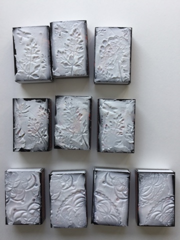
After these experiments I decided to try how the infusions would work on gesso. I cut some corrugated card board, ripped some corners for texture and covered the whole piece with gesso. Once the gesso was dry, I simply added a single colour of the infusions to each one. What's surprising is how nicely these work on a sealed surface. Many water soluble colours go rather pale on gesso, but these are nice!


I continued with lots of background stamping using stamps from different ESN sets, picked the combinations of sentiments I wanted to use, made my focal images by stamping US stamps onto the photo paper with Versafine Onyx Black and colouring with the Infusions... and here I have each of the cards featured alone + a picture of the pieces before assembly. My idea actually built itself around the lovely "Do not fear mistakes" -stamp from USSL1 . Combining it with short quotes/ parts of quotes from Sara Naumann stamp sets kind of gave me dozens of cool new quotes. I picked three, the rest are still waiting... and after this week is over, I'll be publishing more for sure!


Background made with Golden Sands and Sunset Beach infusions, the same colours have been used to colour the stamped image with three girls. I first mixed some of both with water and dipped the photo paper. The result was a skin colour. After stamping I used bleach to get some white and the same infusions to add yellow on the dresses and pink on the cheeks. Sentiments from ESN15 and USSL1.


Background with The Sage infusion (perhaps a touch of Golden Sands too?) The sage has been used for all the other pieces too. The eggs have a couple of layers of Glossy Accents on them and the wooden bird has been heat embossed with black. Sentiments from ESN20 and USSL1.


Background with Sunset Beach and The Sage infusions. A piece of stamped and coloured Grunge Paste has been embedded into the piece of cardboard. The doors open so it can just and just be seen. I was lucky to find a heart locket for the door handle. Sentiments from ESN17 and USSL1.


Thanks for popping by, do check Miriam's and Tricia's projects too, we all had fun getting our projects done, playing and experimenting. Wishing you a crafty summer :)


Problems with Solutions

Posting for the VivaLasVegaStamps July challenge (steampunk it), SanDee and Amelie's Steampunk challenge (anything with steampunk goes) and the WOW embossingpowders July challenge (favourite embossing techniques). I made three ATCs using the VLVS moodboard and prompts (at least steampunk, copper, umbrellas, underwater, script). I love using embossing powders with stamps, it makes images pop out and gives texture to the piece. I also love embossed splatters, here I have both stamped splatters and splatters made with chunky embossing enamel. All stamps are from VivaLasVegaStamps.


The lovely Banksy girl has been stamped onto transparent shrink plastic with black Stazon. I turned the plastic over and coloured the other side with blue and green alcohol inks. The tricky part was shrinking the pieces, they were A6 size (about american A2) and got into horrible curls. I did my best to open the shrunk piece and squished it with an acrylic block. I guess this size should be baked in the oven? 


The text is cut from a math book (luckily the index has this title over and over again!) and the background has been stamped with the Ledger background, small gears (some heat embossed with WOW Verdigris) splatters from the Coffee Ring stamp and some chunky black embossing powder. The plastic was attached with glue dots, they kind of look like bubbles behind the surface. The bends and wrinkles in the plastic ended up being quite cool, Here you can see how fantastic the piece looks with the sun reflecting itself around the insides of the plastic.


Paskis #324

Tämänkertaisessa Paskarteluhaasteessa pyydetään resist-tekniikkaa. Väriä hylkivänä "vastuksena" on tässä kortissa kohojauhe, värinä Brusho-jauhe. Käytin valkoista kohojauhetta, sillä väri voi kulkeutua paperissa kirkkaan kohojauheen alle (jolloin leimakuva erottuu huonommin). Leima on Carabellen, leimasin Versamarkilla, ripottelin päälle kohojauheen ja sulatin sen. Kohojauheen muoviseen pintaan ei tartu väri, ja lisäksi kohojauheen muodostamat alueet aiheuttavat hauskaa epätasaisuutta värin leviämiseen ja kuivumiseen.


Korttipohja on Tigerin akvarellikorttipohja, se vääntyili kosteudesta melkoisesti, mutta palautui aika hyvin. Täytyy vielä laittaa jonkun painon alle... Korttipohjan takana on postikorttipainatus, eli tarkoitus olisi lähettää tämä tällaisenaan. Ompelin reunojen ympäri vähän kuin kehykseksi, se näkyy ihan hauskasti myös kortin "kirjoituspuolella". 

sunnuntai 10. heinäkuuta 2016

W is for the Weddell seal

The Craft Barn alpha/dictionary challenge is asking for W. My wildlife encyclopedia didn't offer many options, because w is not really used in the Finnish language :) Anyway, let me introduce you to one of the largest seals that exist. It is also an extremist, being able to dive deeper and longer than any other seal! The weddell seal is relatively common and has been researched a lot... and it has been measured to dive up to 600m deep and to have stayed under water for even 75 minutes. I would be quite at loss for air even after 75 seconds!


I used a bit of tissue paper coloured with Paperartsy Infusion The Sage for the background. My table is a mess, and I haven't been able to find the little snippet that says "weddellinhylje" that should go on the front of this card. For the back I used a Rubber Dance background stamp inked with a bunch of Distress inks.


perjantai 1. heinäkuuta 2016

Unelmointia

Paskiksessa on bingo, ja tietenkin pitää päästä mukaan. Aluksi mikään rivi ei tuntunut omalta, aina tökki joko "one layer" tai "ei kortti" tai jotain, mutta sitten tajusin että minulla on lattialla kasassa keskeneräinen pahvinen art journal. Rivi on siis violetti-x-ei kortti. X voisi olla vaikka sininen, niin ei tule väristä sanomista.


Ilmoittauduin Carolyn Duben ilmaiselle verkkokurssille, jossa valmistetaan siis pahvilaatikosta art journal ja etsitään kokeilevaa leikkimieltä omaan tekemiseen. Kurssi löytyy tästä. Ensimmäisessä vaiheessa leikeltiin pahvit ja lisättiin gessoa ja värillisiä papereita ilman sen kummempaa suunnitelmaa.


Seuraavassa vaiheessa katsottiin läpyskät läpi siltä varalta että niistä sattuisi silmään hahmoja, ja tässä näin selvästi pupun. Sitten ei muuta kuin rakentamaan se muillekin näkyväksi :) hahmottelin hiukan lyijykynällä ja maalasin sitten akryyliväreillä ja ohuella pensselillä. Pöydällä oli läjä pellavaa jonka olin purkanut jonkun kankaan reunasta, siitä häntä. Löysin ilokseni sapluunan jossa oli sanoja (vaikka olisin voinut vannoa ettei minulla sellaista ole!) ja leimattu tekstikin lojui käyttövalmiina (ja sopi täydellisesti peittämään aluspaperissa olevat koesuoritukseen liittyvät merkinnät, jäljelle jäi sopivasti sana "alku").