Näytetään tekstit, joissa on tunniste Mixed Media. Näytä kaikki tekstit

maanantai 20. maaliskuuta 2017

Catkins and Snowdrops

Joining in the fun at Our Mixed Media Moods (moodboard with grey shades), Paperartsy (doors, windows and architectural structures) and SanDee and Amelie's Steampunk/industrial challenge.
I made a wall spring themed wall-hanging in black and grey colours.


The base is a wood panel that I covered with some stamped scrap paper (the squiggly plant is from Designs by Ryn) and coloured with acrylic paints in grey and white and pigment powders. I sprinkled black bister and Paperartsy Sage infusion onto wet paint, spritzed and let dry. I sewed together a pile of fabric and started stitching snowdrops by hand. I was quite surprised how fun that was (I'm not really that interested in embroidery, but knowing the back could be full of strings and jumps made it a bit easier). I found some welding practices in the trash of a metal classroom at school, straightened one out and decided to make it a wonky window.


Actually I felt a bit bad about covering the embroidery. I wanted to add a bit of air to make it possible to see the sewing behind the frame. I nailed four nails so that the frame is on top of them. Right now it's fastened with glue dots, but I think they aren't enough against gravity, so I'll have to figure out something stronger. It's hard to show the dimension with pictures from the front of the project.


sunnuntai 19. helmikuuta 2017

A little fragile

A last take on the fabuluos mood board at Our Mixed Media Moods. I used the gorgeous deep red, the lead grey, fibres and butterflies. I'm also posting for the Designs By Ryn customer creations challenge and the Craft Stamper Take it Make it challenge (anything with stamping goes). I usually do cards and work in my art journal, but this is a wall hanging (as soon as I find a way to hang it up...)

On Thursday evenings I have a furniture class, where I'm working on fixing an old sofa. The class is tought in secondary school craft classrooms, and I dug into the trash bins in the woodwork room (found some nice square panels) and in the metalwork room, where some students had been practising welding... from trash to treasure that is! I covered the wood with bookpaper and painted over it with acrylic paints (golden quinacridone crimson, magenta and violet) and layered on some fabric and the metal square. These were simply fastened with some small nails.


I stamped the moth (Designs by Ryn) and sentiment (Dina Wakley) with Versafine Onyx Black and heat embossed with clear embossing powder. The moth got some colour with the same acrylics I used in the background. I adhered the sentiment on the side of the panel, kind of as a bonus detail for someone who cares to take a second look at the project. I love the contrast of the fabric and metal!


torstai 9. helmikuuta 2017

Melanthium vulgari

Posting for the challenge at Our Mixed Media Moods. They have a beautiful moodboard, from which I took the deep wine red colour, texture, fabric/threads and black and white florals. I'm also posting for the VivaLasVegaStamps challenge (used reds, oranges, pinks, purples, splatters, drips and drops, check their moodboard behind the link) and the Craft Stamper take-it-make-it challenge where anything with stamping goes.


I made the background by scraping heavy body acrylic paints on a card with black gesso. I used some texture paste and heat embossed it with sparkly pink embossing powder. I didn't like the effect (it turned somewhat silvery) and continued with the acrylic paint, making it thick layers and continuing with the palette knife.  I mostly let the paint airdry, even though the heat gun gave some lovely bubbles (when I tried the heat embossing). The embossing powder still shows, but just as a gritty texture, which I like. All the stamps I used are from VivaLasVegaStamps: the lovely detailed flower in the foreground , the ledger and some botanicals and a plate number (the plate with the melanthium vulgari) in the background. 


Red!

A spread in my art "new" art journal, an old book. The layout and text are inspired by Wanderlust 2017, the colours inspired by the Our Mixed Media moodboard (reds, black and white, flowers) and Art Journal Journey (50 shades of red). Both calling to get me of my comfort zone. I have two drawers full of acrylic paints, and managed to find one red tube!


I started with gesso and spread squirts of red, orange and pink paints with a spatula and smooched the pages together. The red became a bit more dominant than I had thought, but I like it. I stamped flowers on book paper (Stampotique flower cube and Jofy from Paperartsy), fussy cut them and some leave from the leftover paper and adhered with gel medium. Doodles with sharpie pens... and spring stamped with the Everything Art letters from Paperartsy.


Wanderlust 2017

I'm taking the Wanderlust 2017 online class. It's the first time I've ever paid for online classes, and this will continue all year long. I decided to alter an old book for the classes, and I now have a few spreads done. Here's the first one. I have decided to try and do a bit of crafting EVERY DAY. Hope it works out!


I thinned out the first third of the book, cutting out the middle two of every four pages and gluing the remaining pages together. I'll continue thinning it as I work forward, if I have a bulk of pages left at the end of the year, I'll make a niche... but if I end up filling the book, that's fine too :) here you can see the thinned part. The darker strip at the bottom of the page is were the leftovers of the cut out pages are glued in between two whole pages. I used a moist glue to begin with and the pages warped quite a bit... so I changed to a stick glue (of course burnished thoroughly!) To be seen if it has an effect on what I can do with the spreads!


maanantai 23. tammikuuta 2017

Rust and fibres

I got inspired by several moodboards, and ended up with this card. I'm posting it for the VivaLasVegaStamps challenge, check the moodboard and links here (inspired by foliage, nature, bugs, wings, numbers, script, invoice, background stamps, tan, black, white, brown, distressed, grungy and Corrie's lovely butterflies in this DT-post). I'm also linking to the challenge at Our Mixed Media Moods. Their previous moodboard had lovely rusty bits and bobs, and that's when I started building the dragonfly. The new moodboard has wings, copper flower stems and fibres, so all in all the result is using everything but the magenta colours. All the stamps I used are favourites from VivaLasVegaStamps.


I like to collect rusty bits that I run into outdoors, and this nail is one of those... I used pliers to straighten it a bit. The wings of the dragonfly are from "girl with wings". I stamped the wings twice on acetate, fussy cut them and tried to adhere them to the nail with gel medium. I wanted them on top of the nail, like on a real dragonfly. It didn't work, but they attached to each other, which was a step in the right direction. The next step was Glossy Accents, which seems to have done a good enough job. The fibres have been adhered with gel medium and once that was dry, the dragonfly was stuck down with some rolled glue dots.


The background is cardboard with a layer of gesso. I stamped the Invoice and Numbers -stamps with Archival ink. This Tree Circle stamp is one of my first VLVS stamps! I stamped it with Versamark and embossed it with WOW Copper Pearl embossing powder. 


A last photo of the whole piece. Love it! And by the way, I bought one of those bright light- lamps... I'm overjoyed to be able to take pictures like this without daylight :) 


sunnuntai 8. tammikuuta 2017

A Misty Morning

Joining in the Country View January challenge and the Craft Stamper "Take it Make it" challenge. Both are running with anything goes, and that's great for getting rid of some bits and bobs that have sat in the WIP pile for too long :) I'm also joining in the moodboard challenge at Our Mixed Media Moods, because it made me remember these pieces and dig them out. The Craft Stamper demands stamping in their challenge. Well, I haven't actually stamped, but I've used a rubber stamp to make the focal piece... hope that counts!


Here are the pieces, all experiments from last summer. I played with Paperartsy infusions on several surfaces. The large background piece was made with Sage infusions sprinkled on thin wrinkly kitchen wrap. I spritzed with pearl spray and pulled prints onto inkjet photo paper. I love the hazy, misty looka and rusty spots from the walnut stain in the Infusions (fits perfectly with at least parts of the OMM mood board). The small paper is the same infusion dripped onto the photo paper and rinsed away with water. The walnut stain rinses of and the intensity of the colours depends on how long you wait before rinsing. The focal piece was made with a rubber stamp and gel medium. I spread the gel medium over the tree stamp (Paperartsy Urban Snapshots), left it to dry till the next day and peeled it of the stamp. Not only did the stamp become red and clean, but the negative silhouette really worked nicely to give a good relief. It's been spritzed with different sprays and perfect pearls etc. Not all of it stuck to the surface, so I can't really say what I would use to repeat the same effect...


Here's a closeup that gives a hint of the subtle shine on the different layers.


lauantai 31. joulukuuta 2016

Happy New Year!

A really last minute entry for the VivaLasVegaStamps December challenge! Check the lovely moodboard and other challenge entries here. Since the colours are similar to the moodboard at Our Mixed Moods, I'm also posting for that too. It would of course be impossible to ride a hot air balloon in space, but... who cares? I'm really looking forward to everything we're headed for in 2017 :)


I used a mixed media background (scrap paper glued on scrap card and covered with gesso), sprayed with Dylusions Calypso Teal spray. The stamp is from Viva Las Vega Stamps and I stamped with Versafine Onyx Black. I was quite satisfied how well the image turned out, even though the background is uneven. I added texture paste through a star stencil and since the spray seeped into it, I  coloured over the stars with a paint marker.


maanantai 26. joulukuuta 2016

Dreaming of a white Christmas

Here are my Christmas cards for this year. I'm posting them for the Country View December challenge (Christmas) and the WOW embossing powders challenge (winter, links in the comments). I wanted to do mixed media and use some scraps... and the results are quite cool, though my husband said they look like wedding invitations!

the joy of their children
I layered down book pages, off white cotton fabric. Sewed around them and added white texture paste (Aleene's glitter snow), heat embossing and a small sentiment. Each card is different, because the sentiments are all cut from the book pages. The book has nothing to do with Christmas, and I was surprised how many suitable sentiments I was able to find. Most of the sentiments got some white behind them to stabilize the layers.

above all trails
at a very slow pace


rejoicing hearts
the glimmer of thousands of lights being lit
in halls of stars
full of smile, satisfied
the faraway tinkle of bells
life and time rejoiced


lauantai 20. elokuuta 2016

Notebooks, version 2

I have continued piffing up my daughters notebooks. These are A4 size (originally dull grey) and I've used acrylic paints, stamps and heavy gloss gel to decorate them... playing with the Paperartsy patterns-challenge. The stenciled gloss gel gives a subtle shine and texture that depends on where the light come from.


I really like this brown one, that obviously became a math notebook (wonder why?) That stamp from the Paperartsy Everything Art -series is just awesome. Also the blue notebook turned out the way I wanted... Well, the gloss gel stars looked gorgeous in milky white before they dried, pity I didn't use molding paste instead!


This yellow one ended up stressing me a bit. There is a layer of gesso under the paints, but it isn't opaque enough and the grey cover distorts the yellow. After stamping the colour wheels I heat embossed some texture with WOW pastel yellow. While heating the first one I realized bright yellow would have been much better... but I already had the pastel all over waiting for heat, so on I went. I random stamped some orange and added the circles with gloss gel. Again it looked fine when wet and milky, but as the gel dried, the pastel embossing was just too light. I used a white Sharpie to colour the gel and balance the palette. Not bad after all! Those colour wheels have a citrus touch to them :)


sunnuntai 14. elokuuta 2016

No black

I decorated some matchboxes for the Lavinia Stamps challenge (no black). And since these contain matches, I'm also posting for the Simon Says Stamp Monday challenge (try to contain yourself). I picked a selection of Lavinia stamps... really loving the text, but the plants worked nicely too :)


I have a tub of texture paste that is drying out, and I found it is quite nice to stamp into, no need to wait for the paste to partly dry, just straightforward stamping with water. Once the paste was dry I painted the covers with acrylic paints, starting with a dark colour and then dry-brushing with lighter shades to bring forth the texture. The final layer was Golden Irridescent Gold -paint. I guess the same effect could be done with a metallic wax.


perjantai 29. heinäkuuta 2016

Matchboxes

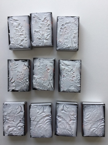
The Craft Individuals July challenge is asking for mini art. I made a pile of matchboxes using texture paste and CI rubber stamps.


I happen to have a tub of texture paste that is on it's way to dry out. It's perfect to use for stamping, because I didnät have to wait for the paste to settle before I stamped into it. I took a small bowl of water and lay the stamps I wanted to use into it. Then I just picked the stamps, shook of the water (leaving them wet but not dripping) and pressed them into the paste. I used plants and doilies. The matchboxes were rather black, and I didn't do anything to cover the logo on the cover, because I planned to rub the texture with acrylic paints that would cover anything that happens to show through the paste.


I decided to try sprays together with the acrylics, and the result was nice. The weeds got a layer of green Fresco Finish paint, after which I sanded the pieces to emphasize the texture. Then I added Interference Gold acrylic paint and finished part with some green sprays from Lindy's stamp gang and part with light blue from Tattered Angels.

I tried different shades with the doily boxes. The left one has just a pink mica spray, sanding and some Interference Gold acrylic paint. The right one has the same + some Bubblegum Pink spray. The middle one has violet acrylic paint rubbed into the texture, sanding, Interference Gold paint Crushed Grapes spray. The brown one has several different copper/brown sprays and some Interference Gold too. I like the way the black background shows through in the thinner places.


Here are some closeups. It's fun how much texture and interest the pieces have, because looking at these one wouldn't guess how fast these were to do. Just some drying time now and then.