tiistai 31. maaliskuuta 2015

Create your own sunshine

I'm getting greedy, this is my third entry for the Craft Barn calendar challenge. This of course means, that if everything goes well, I'll have three calendars at the end of the year, how cool is that? This started with a leftover image (the dancing lady, Rubberdance) and the feeling I should practice scrapbook -style layouts. Besides the Craft Barn challenge (Yellow and rabbits) I am also posting for the SimonSaysStamp challenges Monday (pastel colours, I admit my yellow lace is a bit bright) and Wednesday (Anything goes).


I have several 8x8 scrap pads that I've bought on sale and never use. This orange card is from the DCVW Mediterranean pack. The lady and the sentiment are from Rubberdance, the willow branches are Chocolate Baroque and the bunny from Crafty Individuals.

As you can see, there is no calendar visible. That is because I checked on the "real" calendar we have on the wall, and decided to copy the structure: the March calendar days will be behind the April page once I choose what card to use for it. Before building my image I made holes for jump rings and drew a grid behind this one and filled in the days of February. I have used the standard Finnish calendar layout with weeks running from Monday to Sunday and I added the name-days, because they usually are present on Finnish calendars.


I really like the way the willow branches turned out. I stamped the branch with Versafine Vintage Sepia and coloured the twig with a colour pencil and covered the whole image with glossy accents. When dry, the glossy surface works as a resist, and I added green inks with an ink blender. On the first two I added white sharpie on top of the Glossy Accents, but on the other two I decided it was unnecessary.

This will certainly be my last post for March, now I have to get some real work done before I start attacking my missing calendar pages for January and February... and whatever comes for April!

Spring images

The Craft Barn weekly challenge asks for retiform stamping (luckily they also provide a tutorial for it!). New things are worth a try, and to make it easier for myself I chose to keep it small and made an ATC.

I started of by masking the areas and using an ink blending tool to define them with Peeled Paint Distress Ink. All the images are from Chocolate Baroque spring sets, I did some second generation stamping and added white with a Sharpie pen afterwards. The technique was fun and easy enough, but looking at this I realize some more experience would be needed to really be able to plan what part of the stamp ends up visible in the wanted area in stead of just hoping it will look ok. The placing of the branches in the top area bugs me most, but better luck (or experience) next time!

maanantai 30. maaliskuuta 2015

Ympäri mennään, yhteen tullaan

Mukana Paskiksessa parin viikon tauon jälkeen. Tällä viikolla aiheena on bingo, josta valitsin rivin gesso-ympyröitä-piirustelua (tässä järjestyksessä) jostain syystä tietokone ei nyt halua ladata näitä padistä lähetettyjä kuvia, joten täytyy ladata padillä, jolloin tulevat aina tuonne vasempaan reunaan!


Aloitin lintuaiheisella Ikeasta ostetulla kortilla. Näitä sai josjus 5kpl paketin 20 sentillä, enkä voinut olla ottamatta, kun ajattelin että niitä voi käyttää kortinteussa kehyksinä ilman että tuolla kuvalla on niin väliä. Nyt kuitenkin tipu pääsi pääosaan, kun lisäilin mixed media -hengessä reunoille gessoa ja ympyröitä. Piirustelu hoitui epätyylikkään suttuisesti kun hinkkasin kynänjälkiä kostealla vesiväripensselillä paremman puutteessa. Näin siis kortti tuunautui omanlaisekseen, voisi tämän kehdata jopa lähettääkin jollekulle!

Home, messy home

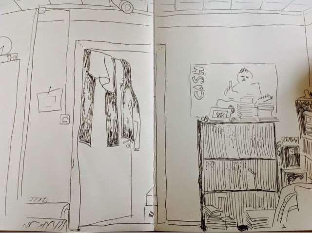
Last weeks DLP art journaling prompts encouraged to do some doodling as the main focal point of the art journal page. Since I have trouble getting any crafting done without challenges, I'm glad the SimonSaysStamp Wednesday challenge is doing Anything Goes this week, because this spread would probably not fit into any other sensible category!


Especially, the DLP encouraged to draw with a permanent pen, no pencils... For a pencil girl like me that was a difficulty to be overwon, and I drew the messy view across the room from my crafting spot. I realize right now how much I dislike that poster my husband has chosen for the wall. Might have to ask if it could go elsewhere. 


Here is the plain drawing, I really didn't like it, but my teenage daughter said wow! Both when she saw this and later when she saw the coloured version. I painted the drawing with watercolours and did a little stamping to add texture to the wallpaper.

sunnuntai 29. maaliskuuta 2015

Pick a fave

Inspired by the SimonSaysStamp Monday challenge (one stamp, many ways) I made a spread in my art journal featuring a new Rubberdance stamp in alltogether 7 different images. I was actually thinking of only a few different images, but got carried away in the process, which suits the ongoing DLP art journal prompt "Ride the energy of your own unique spirit". I did my best to keep to the Rubberdance March challenge colours (green, yellow, orange), and this of course fits the SimonSaysStamp Wednesday challenge and the Country View challenge (anything goes on both of them).


Each of these gorgeous ladies of course deserves a portrait of their own! Sorry about the bad light on these, daylight dissapeared, and I can't wait until tomorrow, because the SSS Monday challenge will run out!


I actually did this as a test, and the image turned out as perfect as one might wish. Watercolour stamping is easiest done by starting with the lightest colours. To begin with I inked the face and hand with Tattered Rose and the robe and background with Mustard Seed. Next I added some Brushed Corduroy on the edges of the face (also the hair side) and whisps of Mowed Lawn on the robe and fan. Last I added Black Soot on the eyebrows and outside edges of the hair and Spiced Marmalade on the text background. After spritzing with water I stamped on Canson Imagine mixed media paper. The tree and fan are from VivaLasVegaStamps and have been done in the same way.


This girl has been paperpieced with oriental-style pattern papers (really cheap ones bought from Tiger). I stamped her on several papers (all in the pack that were green, orange or yellow) and combined them as best I could. I especially like the background paper, and made some little flowers to go with it.

This lady was stamped with Versafine Onyx Black and embossed with clear embossing powder on satin card from Crafty Individuals. The effect of the good quality card is extroardinary, and I wanted to enjoy the dramatic detailed black and white image as it is, so I added strong colours around it. I found this single button in my stash and sewed it on with my sewing machine.


To create a vintage photo kind of look I used an ink blender to spread brown inks on a pearlescent card from Chocolate Baroque. The image was stamped with Versafine Vintage Sepia, and bleached out a bit with water before some subtle green and orange were added. The feathers have been stamped with white ink onto vellum and fussy cut (really fussingly) which gives quite a realistic look.


I had planned to do some more paper piecing, this image was stamped just to get an orange shirt for the green girl, but the shirt part was a bit dull, so I stamped a green shirt for her in stead. I like the grungy look on her, there was a dragonfly on the underpaper I tore for her, so I had to dig a dragonfly brad from my stash.

This is the lady I planned to give an orange shirt. After stamping on green underpaper with archival ink I felt she didn't really need any other colours on her. After some consideration (and messing my fingers and smudging the red image) I added clear embossing powder, and was glad it still stuck.


Last but not least I made an image in the way I usually do cards: Black Versafine, watercolours and some sewing. looking at the other images makes me wonder why I always do this, when other cool and interesting options mostly worked well.


To emphasize the oriental feel of the page I wrote the DLP sentiment "Ride the energy of your own unique spirit" vertically over and over again on the page. As the text went on, it became easier to keep to straight lines! The DLP prompt included making a custom element on the page, so I used a monogram of my initials that I created ages ago when I was 15. I haven't used it much for the past 20 years (just to sign ATC:s), because after getting married my initials of course changed and I wasn't able to change the A to M.


I ori

The song of a crow

Tha Craft Barn weekly challenge is asking for inky backgrounds and the Stampotique Designers challenge is asking for favourite backgrounds... which to me are mostly the same thing! I made this little card using leftover stamped images from this project and an inky background that I had stowed away in my drawer. Since the music background stamp is used both embossed on satin card and subtle in the background I am also posting for the SimonSaysStamp Monday challenge (one stamp, many ways). The text is a Finnish traditional saying that is merciful towards anyone who likes singing but can't stay in tune:

Also the crow sings with the voice he has.
(In Finnish four words is more than enough to express that, even three would suffice!)


I don't have Brushos, but getting inky with Distress Ink diluted on top of an acrylic block is something I have done every now and then. Usually that ends up with several inky backgrounds, because I don't want to rinse anything away. This background features seedless preserves (of which I have a reinker) and probably Barn Door smudged on the block straight from the ink pad. I like the way the ink acts on satin finished card, and this has been dipped and heatset several times.


I stamped some more of the music background (that is in the triangles) onto the inky base. To make a very subtle and soft image I spread DI Black Soot onto the stamp with an ink blender. This way no detail is lost as in second generation stamping. I typed the sentiment with my typewriter, and after smudging the edges with ink I dabbed with versamark and embossed with clear embossing powder. This way it stands out better, after all the birds and triangles have some glossy embossing too.


A dance for spring

I was lucky with mr. Random and won a grab bag of stamps from the Rubberdance February challenge. They arrived yesterday: a really generous pile of sturdy deeply etched stamps (they are causing a bit of a storage problem :) I have been waiting for them to arrive, wanting to ink them up with green, yellow and orange for the ongoing Rubberdance March challenge. Company stamps are not required, but now that I have them it is more than appropriate! I am also posting for the SimonSaysStamp Wednesday challenge and the Country View challenge (anything goes on both of them)

I looked through my pile, finding lots of beach images that I felt didn't lend themselves to the green-yellow-orange colour scheme. The dancing lady with a flower bouquet felt perfect and I started with some watercolour stamping: I coloured the stamp with Distress inks in yellow, orange and green, spritzed with water and stamped on Canson Imagine -mixed media paper. The first try was too yellow, but the second one was fine. Then the rest was just about choosing what to do with the image!

I found a suitable burnt orange paper in a pad from Studio Light and took some white flowers (Vivi Gade) and stamped on them with stamps from the grab bag: a harlequin stamp and text background from beside an asian woman. You can see (a small part of) the new stamps on the sides, there really was lots in that pack!


To put my card together I cut a narrow strip from each side of the orange paper. It's weird that 6x6 card blanks can't fit a 6x6 paper! I used a ruler to tear a piece of kraft packing paper, crumpled it up and smoothed it out before adhering to the card base. The yellow paper twine has come with a flower ages ago... I added my stamped image and three cute brads that suited the colour (I only had three of these, so they have been waiting for the right project!) and two MDF sprigs from Tando Creative.


I adhered the flowers on top of each other and pierced a hole through them before adhering to the card base. They are hiding the corner that doesn't have a brad and resting on the MDF leaves, so to secure them I continued the piercing through the orange card and added a larger brad. The piece was mounted on a cream card base. These happen to be my favourite colours, so needless to say I really like the result!

perjantai 27. maaliskuuta 2015

The hens they hopped...


An old traditional childrens song has been ringing in my head since I bought a Mary Vogel Lozinac -sheet from VivaLasVegaStamps. The words are approximately

Granny took her little hens to the meadow
The bitsy little hens they hopped around

I remember singing this with my father, fingers hopping and jumping everywhere and repeating it over and over again waiting for the moment when he'd lower his voice and continue with the next verse where a sly, quiet, long tailed fox sneaks in the forest licking his lips... It was so scary and exciting! (And of course special "lucky" time spent with dad :)

The ringing in my head ended up in this card that I am posting for the VivaLasVegaStamps March challenge (a striped bird), the SimonSaysStamp Wednesday challenge (Anything goes) and the Unrulypaperarts readers challenge (I should be so lucky + shades of green).


The lovely inspiration board for the VLVS March challenge suggests among other things a green/white/black colour combination, birds, stripes, splatters and triangles. I really wanted to use the song for my challenge project and started by taking out my typewriter. I wanted to create stripes with the text, and I wanted to place the text a bit randomly... without realizing that my wishes were a bit contradictory I set to work, and I'll admit I was not satisfied with the result: it was a mess!


I had planned on a CAS look without layers, but looking at the muddle of words I decided to cover it with a green inky underpaper and do stamping and fussy cutting on a separate piece of card. Soon I realized that I didn't have to cover all of the card base: stripes of underpaper would calm down the background in a nice way leaving text stripes in between.


I don't have the VLVS writing triangles, but going with the song theme I decided to make my own using their music background. I masked of some triangles on white satin finished card with washi tape before stamping my birds and the music background with Versafine Onyx Black and heat embossed with VLVS Ultra High Gloss Embossing Powder (love it!).


I doodled around the triangles with an embossing pen and added black Zing embossing powder. I like how the sprinkles of embossing powder stuck around where there was some stickiness left from the heated washi tape. Another unexpected and interesting effect was the spreading of the Versafine ink under the clear embossing powder when I reheated the paper to melt the black doodling.


This far everything went well... and then I was left with the decision of what triangles and birds to place on the card... The beautiful hen or the cute little "chick" or both of them... I don't remember when I've last stared at a card for this long, trying out different combinations!  I like the fact that (despite the layers) this does have a CAS feeling to it!


Now I have a couple of triangles and little crow chicks left. I've never seen anyone posting several times for the VLVS challenge, so I guess I'll make something else out of them :)


Kiitos = Thank you

I needed a thank you -card for my craft class teacher, and here it is. I love challenges, and this time I was really inspired by the first four of the following challenges... The fifth is there just because it happened to fit :)
Paperartsy (grunge paste)
Stampinback (focus on text)
Chocolate Baroque (colours blue/purple/greens)
SimonSaysStamp Monday challenge (one stamp, many ways)


 As for how I ended up with all these challenges:

I planned on making a card in the CB challenge colours, and I had decided to cut out the text from scrap card to make a large text stencil and stamp with CB texture fragments. Then I checked the Paperartsy challenge... Wondering what the grunge paste was, I ended up looking through several interesting youtube videos and learning that it is a texture paste by Paperartsy. I also learned that it is claylike, which means it is probably the texture paste I would like to have (I am very dissapointed by the plastic transparency of the texture/modelling pastes in my stash). I decided to use texture paste from my stash with my stencil and add stamping (youtube: grungepaste video 106). Monday came, and after seeing the SSS Monday challenge I decided to keep to a single stamp. 

The background card has first been dipped in Distress ink (seedless preserves) and stamped with the CB texture fragment using Chipped Sapphire spritzed with water... 


As said, I don't have the grunge paste (so the Paperartsy team will get to decide if this post is valid or not for their challenge). I used Deco Art white modelling paste through my homecut stencil and stamped with the CB texture fragment on the wet paste. The picture above shows how "white" it is... 


And here is the card after two layers of gesso on the paste. Perhaps I should try mixing the gesso in the paste before spreading it...


After which I added different green Distress Inks with an ink blender. (At this point I really started to like my stencil, don't yet know what I'll do with it!)


I finished of the card by drawing and shadowing with a promarker and blender and mounting it on a dark blue card base. The texture on the modelling paste is quite cool, even though the details of the stamp are generally not very visible... probably due to a combination of the used paste and my lack of skills, but certainly to be tried out again some other time!

torstai 19. maaliskuuta 2015

Dreams and adventures

The Stampingback challenge asks for projects with focus on the text. I decided to try some recently bought stamps and make a card for a man who is retiring this spring. Because the card has a vintage feeling and some animals I'm also posting for the Paperilla card challenge (Tuulahdus vanhasta / Vintage Style) and the SimonSaysStamp Monday challenge (animals).


All the stamps on this card are from VivaLasVegaStamps. I worked straight on the cream 6x6 card base, masking the edges of the card with washi tape and stamping with different shades of brown Distress Inks. I wanted the images to be very subtle, so I inked the stamps with an ink blender instead of straight from the ink pad. This way all the details of the stamps show, but the images are in the background, as if behind fog.


Using the same inks (but from the ink pads this time) and some black I stamped the sentiments and embossed them with clear embossing powder. I like the vintage feeling, and the focus really is on the text that pops out nicely. I finished of by stamping some hot air balloons on the envelope too.


keskiviikko 18. maaliskuuta 2015

WOYWW #303

It's Wednesday, and that means it's once again time to hop around the world and peek at crafty desks and workspaces, all hosted via Julia's blog. I could have sworn this should be #302, but Julia posts #303, so I'll believe her... Here is my desk (our living room table) today:


I can see I still have my old russian watercolours out after using them on an art journal page, and under them a stencil from an earlier project. I am trying to put together a couple of cards, and have been trying out different brown inks, both from the inkpads and spread on stamp with the ink blender (which gives a light but detailed image). I also ended up cutting out the elements, if that would help me with their placing. The other side of the table seems to be ever so full of comic magazines, but that means I don't have to feel all guilty about the mess! And besides, I just pile my stuff on top of the rest...


I got a mail from my aunt on Monday (that bird behind the gluestick). She had been to Andalusia and enclosed a beautiful laser cut card from a museum shop: a double folded card with two layers of intricate cuts that complement each other, and behind them a translucent golden paper... Makes me wish I had a Silhoutte cutter or something of the like!


tiistai 17. maaliskuuta 2015

Kevättä rinnassa

Lähdin tekemään sivua art journaliini (siis, eikö tuolle kirjalle voisi keksiä jotakin suomenkielistä nimeä?) Viime aikoina olen tehnyt paljon kollaasijuttuja, ja pöydälle kertynyt aina vain pienempi silppu alkoi jo tympiä, kunnes keksin liimata siitä kehyksen tähän aukeamalle. suikaleista tuli auringonsäteitä, eikä sitten tarvinnutkaan kuin lisätä vähän vesivärejä.


Olin ajatellut jättää muutaman Paskiksen väliin, mutta saatuani palat liimattua minulle tuli mieleen Paskiksen inspiraatiokuvan pastellisävyiset kynät, ja rupesin katselemaan kelloa ja Paskiksen sivua: 50 minuuttia aikaa, joten levitin kollaasipohjan päälle kerroksen kirkasta gessoa, ja sen kuivuessa aloin jo kirjoitella tätä postausta valmiiksi! Tässä kyseinen välivaihe:


Kiire tuli, juuri nyt jännitän saanko tämän ajoissa laitettua, sillä aikaa on enää 10 minuuttia :)
Lenksura vasemmalla on maaliskuun Timholtz-tagia varten, näin:


sunnuntai 15. maaliskuuta 2015

Fantasy garden

I have been posting for the Craft Barn calendar challenges, but after deciding in March to start making two calendars, I have to make the missing pages for January and February. This is the February page, following the Craft Barn February prompt words (Red and Hearts). The CB link for the Feb calendar is of course already closed, but I am posting this page for their weekly challenge (handmade flowers) and the SimonSaysStamp challenges Monday (B is for...) and Wednesday (Things that fly).


The base is A4 Canson Imagine -mixed media paper. I masked of the calendar part and used some miscellaneous background stamps on the upper part to create some interest in the background. The layer of light green acrylic paint was spread with the side of an old plastic bonus card. Everything else has been built up from handcut pieces of underpaper (mostly old math tests) and scraps of painted canvas. I started by cutting out a bunch of red hearts. I really like the way the heart-flowers turned out! I adhered the pieces with a gluestick and did lots of sewing. The bunting was a way to get rid of a pile of small triangles that I had in my drawer after working on a tag album! As a finishing touch I added some doodling with a white Sharpie and a black Sakura Micron pen.


The March page (Yellow and Rabbits) for this collage calendar can be found here, the January page (Aqua and Snowflakes) is here.


Star gazing

I decided to start a second calendar for 2016 using the Craft Barn prompts. After all at this point I am only two months behind, and I can catch up with reasonable effort. I recently realized how lovely images can be made using collage with underpapers, so I chose that for a personal theme. The Craft Barn words for the March calendar are Yellow and Rabbits. I am also posting this for the Stampotique Designers challenge (Stars) and the SimonSaysStamp Monday challenge (B is for... Bunnies)


The "Crowned Bunnies" are from Crafty Individuals. I stamped them on some yellow underpaper and pieced the crowns with complementing colours. I didn't want the page to become too thick, so I started by stamping all over the area with some background stamps, after which I spread some acrylic paints using a plastic card. This gives a very thin layer and the stamping almost shows, even though the colour is quite dark. I continued be collaging the ground and some trees, and sewing on them for some added interest and texture.


I'm sorry I didn't take an in between picture after adhering everything in place but before doodling with a white Sharpie. It is amazing what an effect the doodling had!  Now I'm ready to say this is the coolest of these calendar pages that I've done so far, or that this is one I could put on my own wall. It really makes me smile. 


The other pages of this collage-themed calendar can be found here: